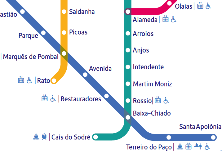
In Lisbon I much enjoyed the metro system, which is full of art and something of which the city is clearly proud. Its diagram uses Metrolis, a custom font from The Foundry. The lines are called seagull, sunflower, caravelle and orient: they have over-fussy graphics that don't quite fit the clean diagram. On the trains themselves the maps can get interesting too. I'm not colour blind but couldn't quite work out why the linear maps seem to turn in on themselves so much. Metrobits.org has a page which lists the fonts used in some 17 metro systems and (if you're listening Santa) I now have to add Metro Maps of the World (new edition, Mark Ovenden) to my Christmas list.