If you're a designer you'll laugh - and then maybe weep. Clients should be forced to watch this before commissioning.
Spotted on Ultrasparky.
By continuing your visit to this site, you accept the use of cookies. These ensure the smooth running of our services. Learn more.
If you're a designer you'll laugh - and then maybe weep. Clients should be forced to watch this before commissioning.
Spotted on Ultrasparky.


 The CND is 50, and the organisation is commemorating its anniversary by encircling AWE at Aldermaston on Easter Monday, just as they did 50 years ago. A new book commemorates a half century of the campaign's enduring symbol, which according to its pacifist designer Gerald Holtom was based on the semaphore signals for N (nuclear) and D (disarmament).
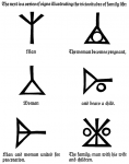
Creativity is a mysterious process, unamenable to logical analysis. Much that appears to be original turns out to be an imaginative fusion of things half-remembered. So it may well have been with the peace symbol, which takes the form of a circle around an inverted version of a Norse symbol - yggdrasil, the 'world tree', or great ash at the centre of the universe.
An Ottawa Citizen review describes how Gerald Holtom asked a shop assistant what she thought of the symbol which was carried by the marchers on what he called 'lollipops'. She liked it, but wondered whether its drooping arms weren't "a bit depressing. Shouldn't peace be something to celebrate?" "He sort of altered his view in that moment," his nephew recalls. "He said, 'Yes, it should be a figure with the hands upwards outstretched'". From then on Holtom always drew the symbol upright.
 In his hugely influential 'Book of signs' (first published in German in 1923 as 'Das zeichenbuch' and available on Google Books) Rudolf Koch uses the symbol to stand for a man who undergoes the 'vicissitudes of life'. On his death, the symbol is inverted (and known as the 'todesrune'). With this meaning the symbol was officially specified for the gravestones of SS officers. Gerald Holtom asked to have the symbol - in its upright form - on his gravestone in Kent. That wish was ignored by the letter-cutter.
In the runic alphabet a similar symbol to the yggdrasil is called algiz, (the elk) and is known as the rune of protection.
Opponents of CND referred to the logo as 'the chicken's foot' and Hopi Indians use a similar design, based on the footprint of a crane, as a symbol of tribal unification. It can also be thought of as an inverted or broken cross, like that used to crucify St Peter.
But the roots of the sign may well lie deep within all of us. As a Jungian archetype, it can be read as female genitalia. A sign for the ancient mother goddess, whose message of peace men so often ignore.
First they came for the Jews
and I did not speak out
because I was not a Jew.
Then they came for the Communists
and I did not speak out
because I was not a Communist.
Then they came for the trade unionists
and I did not speak out
because I was not a trade unionist.
Then they came for me
and there was no one left
to speak out for me.
Pastor Martin Niemöller
Rudolf Koch's symbols are available as a set of fonts issued by P22.

An article in Business Week attempts to get at the secret of Apple's design success. They say it boils down to developing ten genuinely different prototypes to a highly finished level, then letting two separate weekly meetings work away at them. One is briefed to only think 'blue sky', the other must address the practicalities. Ten ideas are then refined to three and finally to one.
I've been using a Toshiba laptop instead of my usual Apple one. It's like comparing a Lada with a Porsche. The Toshiba is all tacky, plastic ugliness compared to the Mac's seductive, clean lines, where everything is understated, integrated and in just the right place.
The Apple design process certainly works: Apple's laptop market share is up by 38% on last year, placing them 9th amongst the competition. The iPhone's iconic status as the must-have accessory for elite geeks so worries Google that they've launched a broadside against it. They claim their open source 'Android' programming environment will achieve more sales because it will be on many different manufacturers' phones.
OK, Apple's design process is thorough, and mildly innovative, but that's not it. They succeed because they have an uncompromising design-led vision - and they stick with it because they know the quality of their design has become an overriding factor in their customers' buying decisions.
Windows enthusiasts love to mock Apple and their lead designer Englishman Jonathan Ive CBE, whose early career famously included designing sanitaryware in London. Even in this apparently metrosexual age, there's bizarrely still something suspect about owning a computer that not only looks good but actually works as well. It seems real men not only don't eat quiche, they also don't do foofy computers that might (whisper it) call into question their owners' masculinity.
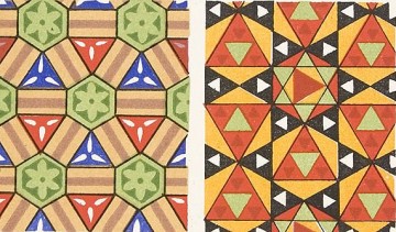
 Web find of the month is a site devoted to complete reproductions of illuminated books. It includes Owen Jones' astonishing Grammar of Ornament (1856), a tour de force of nineteenth century letterpress and chromolithographic printing which has had an incalculable influence on artists and designers from the Art Nouveau to Gaudi in Barcelona.
Owen Jones' most influential book contains his own re-drawing on 'scientific' principles of over 2,000 decorative designs. The scope is vast: from designs created by 'savage tribes' to ornament from the ancient world, Arabia, China, India and Europe. The motifs presented range from intricate and highly elaborate high Renaissance manuscript illumination to apparently simple geometric tile designs from Moorish Spain and Persia.
A passion for the orient
Jones (1809-74) was an architect who became passionate about the superiority of non-European ornament after touring Turkey, Egypt, Sicily and Spain in 1831. Henry Cole, who founded the Victoria & Albert Museum, was one of his many collaborators.
Jones' passion for the near east found expression in his most significant work as an architect on the interior of Christ Church, Streatham. He was criticised for his 'excessive use' of Islamic motifs there.
Acclaimed for his decorations for the Great Exhibition in 1851, Jones worked for nine years on the publication of a lavish folio work, which exploited the capabilities of the relatively new and demanding process of chromolithography. He sold property to finance its publication, setting up his own press and training his own staff to produce it. He did not live to see it succeed commercially, and many copies were remaindered.
Besides including a historical survey and commentary on the many gorgeous full page colour illustrations, Jones developed a series of 37 'design propositions' which attempted to codify the construction of well-made ornament. For Jones: 'All ornament should be based on geometrical construction' And 'true beauty results from that repose which the mind feels when the eye, the intellect, and the affections, are satisfied from the absence of any want'. In his final chapter he advocated a new kind of architecture based on natural forms.
There is an enduring appeal in many of these stunning illustrations. They combine a remarkable and carefully constructed rhythmic intensity with a highly developed colour palette. Since the Modern Movement, architects and designers have associated ornament with the literally superficial, seeing it as a layer of irrelevant decoration that obscures the underlying nature of whatever it is applied to.
For me and I suspect for Jones, the desire to decorate is an integral part of human experience. His use of geometric reconstruction seems to link to metaphysical ideas of the golden section or 'divine proportion' which were taken up by Modern Movement architects such as Le Corbusier.
Good ornament is intrinsic to the very essence of things.
The Grammar of Ornament on CD-ROM for designers.