Ok

By continuing your visit to this site, you accept the use of cookies. These ensure the smooth running of our services. Learn more.

Web

  • 'Cosy Coffee Shops' in Reading?

    08_08_09_moondogs_reading_2.jpgThe county town of Berkshire a mecca for lovers of independently run coffee shops? Surely not. But a newish website has just proved otherwise.

    For decades the rulers of what I used to call the People's Republic of Reading devoted themselves to stripping the character out of the place. They gave us the faceless Butts Centre which metamorphosed into the equally inappropriately-named Broad Street Maul. They tore down much-loved red brick Victorian buildings and allowed what was left to be covered in render and cladding. Independent locally-owned shops (with the exception of much-loved Jacksons) were squeezed out. There was no room in the Oracle (the south of England's shiniest new shopping centre) for local businesses, since they could not be relied on to pay the rent.

    But apparently there are now three attractive, independently-run coffee shops in Reading. Significantly, Moondogs, and the Workhouse Coffee Company are both on the Oxford Road, well away from the uninspiring concrete and glass of borough council-sponsored 'Reading City'. That it took a website to want me to go back into my local town centre shows just how uninviting it has become.

    Tom Hiskey is a 26-year old part-time musician and coffee shop enthusiast. As he travels the UK he is compiling a guide to the UK's best independent coffee shops. Not the faceless, squeezed out of a tube global brands run by Seattle-based corporations or the likes of Whitbread, but real places with their own local character, where the welcome is genuine and the prices are likely to be lower. He emphasises places that source ethically, and says that tea rooms are, well, 'not his cup of tea'.

    Cosy Coffee Shops is just what the internet is for.
  • Lampitt's living maps

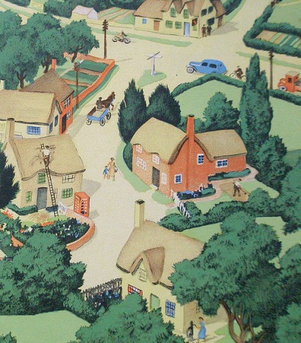
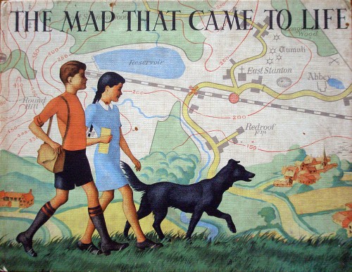
    2863068137_055aef279a_b.jpgA worthwhile post on English Buildings drew my attention to Ronald Lampitt's illustrations in The map that came to life, a children's book first published by OUP in 1948. Elsewhere there's also a complete set of spreads and a page about Lampitt's map of an ideal city.

    The beautifully illustrated cover is slightly reminiscent of Seurat's 'La Grande Jatte', without the pointillism. The book celebrates the fascination of maps as graphical language - ways of representing in two dimensions the richness of the real world. Lampitt paints the archetypal romantic (and very idealised) English village, set in a perfect landscape:

    "These two children set off on a walk across unfamiliar country with only their map for guidance. They talk to strangers – who give them fascinating nuggets of local information rather than luring them into dark corners. Their dog spends most of its time off its lead, rivers and lakes hold no terrors for them, and, of course, this being 1948, they are not much troubled by traffic."

    Picture 2.pngPicture 1.pngLampitt also worked for Ladybird, including the 1967 title Understanding maps, but information on him is scarce. Google Earth can't compete with Lampitt's golden vision of English Never-Never-Land.  2863882570_5ffe9958f2_b.jpgSecondhand copies appear rarely. A reprint is certainly overdue.

  • An excess of brief

    If you're a designer you'll laugh - and then maybe weep. Clients should be forced to watch this before commissioning.

    Spotted on Ultrasparky

  • Thinking differently

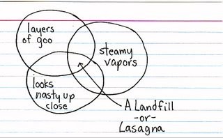
    00c0d68080bc1f7125a7696e5c8c815d.jpg
    A different way of thinking on Jessica Hagy's site. Her index cards express daily dilemmas as pithy graphs and witty Venn diagrams. And now they are in print, too.

  • Waftaroms, indotherms and the graphic language of cartooning

    5e1862021bcdc98a8d317ca95ab3fd5c.png

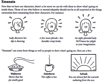
    Don't know a grawlix from a plewd or an agitron from an indotherm? Finding words for the marks made by cartoonists is a funny business. A jokey article about the marks cartoonists make for things like movement, emotion and radiation is now the stuff of earnest research into the visual language of cartoons.

    It seems to have started with American cartoonist Mort Walker who wrote a satirical article in 1964 called "Let's Get Down to Grawlixes," for the National Cartoonists Society. In 1980 he expanded it to a book The lexicon of comicana. In Mort Walker's Private Scrapbook he writes:

    'I spoofed the tricks cartoonists used, like dust clouds when characters are running or lightbulbs over their heads when they get an idea... I spent many hours at the museum recording their "language". I created pseudoscientific names for each cartoon cliché, like the sweat marks cartoon characters radiate. I called them "plewds" after the God of rain "Joe Pluvius".'

    The spoof didn't quite work (even though the words he invented are very funny), because people really wanted words for the marks cartoonists make. So here is a run-down, from Wikipedia:

    • Plewds Flying sweat droplets that appear around a character's head when working hard or stressed.
    • Briffits Clouds of dust that hang in the spot where a swiftly departing character or object was previously standing.
    • Squeans Little starbursts or circles that signify intoxication, dizziness, or sickness.
    • Emanata Lines drawn around the head to indicate shock or surprise.
    • Grawlixes Typographical symbols standing for profanities, which appear in dialogue balloons in the place of actual dialogue.
    • Indotherm Wavy, rising lines used to represent steam or heat on hot objects -- however, the same shape found over a hot apple pie or something else strong smelling is a wafteron.
    • Agitrons Wiggly lines around an object that is shaking
    • Blurgits, swalloops Curved lines preceding or trailing after a character's moving limbs
    • Hites Horizontal straight lines trailing after something moving with great speed, or indicating reflectivity (puddle, glass, mirror). Likewise, up-hites would be lines above an object falling.
    • Lucaflect A shiny spot on a surface of something
    • Dites Diagonal, straight lines drawn across something flat, clear, and reflective, such as windows and mirrors.
    • Solrads Radiating lines drawn from something luminous like a lightbulb or the sun.
    • Vites Vertical straight lines indicating reflectivity (compare dites, hites)

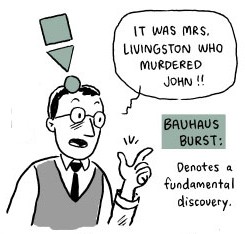
    1db771f1c85e82a60fbd55ef5e240b79.jpgIt's funny in a Sellars & Yeatman kind of way (something else that deserves to be better known). Dash Shaw responded to the comic challenge with a great cartoon strip using the symbols and The Balloonist drew a booklet for cartoonists using some new symbols. Needless to say, the academically minded take it all very seriously. Neil Cohn just about gets the point. But only just:

    'He also attaches a myriad of useless names to them, to the extant that you feel that his whole point for jargon is to be facetious (which it may well have been).'

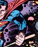
    dae386528cc4e0ed3e7dde35b217ae74.jpgSee also an explanation of Kirby Dots (developed by Jack Kirby to show an energy explosion) and a site devoted to cataloguing onomatopoeia like 'kaboom' (apparently first used in The incredible hulk, vol 1, no. 229, 1978).