Ok

By continuing your visit to this site, you accept the use of cookies. These ensure the smooth running of our services. Learn more.

typography

  • Hair affairs

    deutschlandkarte-popup-600.jpg

    From the site Strange Maps comes this record from Die Zeit of the popularity of awful puns in the names of German hairdressing salons. The most popular is 'Haarmonie'. The others uphold that unfortunate line about the missing Germanic funny bone: Haareszeiten puns on Jahreszeiten - which means seasons - and Haargenau just means 'exactly' in the sense of 'to a hair'.
    Enertaining whimsy, including the menacing hairy outer darkness surrounding Germany, but not very effective map-making. I wanted the map to be dynamic, revealing photos of shop signs, much like the ones featured in the Hairdressers With Funny Names Pool on Flickr.

    Picture 2.png
    sanseriffe2.jpg
    The predeliction of English salons for this kind of linguistic tomfoolery is so great that they made up a good part of a Guy Swillingham's Shop horror: the best of the worst in British shop names. If you can excuse a comment about one map which is made up of 'mere typography' Strange Maps has many other gems, including a description of  the Guardian's April 1977 feature on San Seriffe
  • Following the diagram in Lisbon

    Picture 4.png
    In Lisbon I much enjoyed the metro system, which is full of art and something of which the city is clearly proud. Its diagram uses Metrolis, a custom font from The Foundry. The lines are called seagull, sunflower, caravelle and orient: they have over-fussy graphics that don't quite fit the clean diagram. On the trains themselves the maps can get interesting too. I'm not colour blind but couldn't quite work out why the linear maps seem to turn in on themselves so much. Metrobits.org has a page which lists the fonts used in some 17 metro systems and (if you're listening Santa) I now have to add Metro Maps of the World (new edition, Mark Ovenden) to my Christmas list.
    Picture 1.pngmetro inside.jpg

  • Letters from Bethlehem

    DSC01020.jpg

    Up a narrow street in Belem, Lisbon, and just yards away from the hungry tourists queuing for their Pasteis de Nata (the custard tarts which are a Lisbon speciality)  there is a chapel which re-opened as a gallery in September this year. Its outer wall has been transfomed by an art installation inspired by wood type. Chunky sans serif lettering of differing heights and depths has been applied to the wall and then given a coating of bright white render. The bold capitals are stacked into arrangements vaguely reminiscent of Henrik Werkmann.

    The Chapel of the Immaculate Conception was dedicated in 1707. Unlike much of central Lisbon, it survived the catastrophic earthquake of 1755. The messages which now cover much of the outer wall are mostly religious, and more rigidly arranged than Werkmann's anarchic experiments. The piece is called 'Vai com Deus' (Go with God) and is the work of Oporto studio R2 Design.

    It must have been a nightmare to specify and install. The letters have been individually pinned to the wall and are not always spaced or aligned with the kind of perfection we are used to. Perhaps this is why it has yet to feature on the web site of the award winning designers.

    DSC01022.jpg


  • Blankets and blazons

    3818aebed5854d256cd49bbbd707723e.jpg

    Is it just me? I like old blanket labels. The design of some of these little scraps of silky cloth is fascinating. This 1950s blanket with its evocative label was brought by sea all the way from Australia over 40 years ago. Because she has a Physician chillproof blanket, the happy lady with the bedside flowers will soon be well again. With that sales pitch and with such a striking embroidered design, it's no wonder they sold.

    When they were younger my nieces were obsessed with the silky feeling of all kinds of labels. On blankets or teddy bears or sewn into clothing, stroking them was the perfect comforter. 'Continental quilts' (with all their associations of bright sunlit roms and Scandinavian health and efficiency) are all very well, but on a really chilly night you can't beat the comfort of a really good heavy woollen blanket.

    9590fc02ad8556e6a341df42bf8912ee.jpgccb665ad54d76723a095def83976fd08.jpgHere in Oxfordshire there was a long tradition of blanket making (they used 'tenter hooks' that are the origin of the familiar phrase). An excellent site, from which some of these images are taken, describes how until the last factory closed in 2002 the Witney blanket was a byword for quality. Made using local wool with a soft spun yarn that formed a fleecy pile, they were widely imitated until a trades descriptions case in 1907 put a stop to such 'passing off'.

    At its height, thousands of people were worked in the blanket making industry in Witney. The museum there holds a guardbook which contains over 150 blanket label designs used by just one manufacturer in the town.

    24ea33f2a3451b37b956e863d07c1b0d.jpg
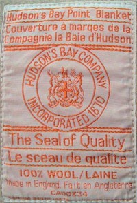
A special kind of Witney blanket was sold to the hugely powerful Hudson's Bay Company in Canada which traded them with native Americans for beaver furs. These point blankets are an early example of a graphical language being developed to symbolise a product standardisation system. The blankets were graded according to their size and warmth using a system of striped marks which showed up when the folded blankets were stacked together.

    There is a full description of the grading system on the Hudson's Bay Company website.

    In November 1779, M. Maugenest met with the Board at Hudson's Bay House in London to deliver his "Proposals of the Terms" under which he would enter into Hudson's Bay Company's service. He offered several suggestions for improving the growing inland trade from Fort Albany along the west coast of James Bay. The sale of "pointed" blankets was one of his suggestions. By December 1779, the sample blankets had been received by the Committee and an order was issued for 500 pairs of "pointed" blankets; 100 pairs of each, in 1, 1.5, 2, 2.5 and 3 point sizes. Although blankets had been a staple of the fur trade to the natives and Hudson's Bay Company men prior to 1780, it was not until the first shipment to Fort Albany in the spring of that year that they were shipped to the posts on a regular basis.

    By 1860 full standardization of both sizes and colours had been established.
  • The beast within?

    4e36d189e0cf3670365e8ab8b8bf9eb7.jpg

    A report in Pravda (of all reliable sources) says that centaurs were real. Researchers decided this because of the number of cave paintings depicting the chimeric creatures. The article states, in a somewhat old-fashioned translation, that:

    "Historical sources reveal that buggery was very popular among ancient Greeks and Romans. A legend says that Greek scholar Thales recommended his master Periandr not to engage unmarried shepherds nor to produce more centaurs."

    b8a72e438fe365e06556089db05d744f.jpg

    That interpretation may not convince, but there is no denying the creatures' pervasiveness. For 3,000 years or more the half-man, half-horse has been lodged in the collective consciousness, inspiring myth-making and art, standing both for animal passion and for the genial guardianship of knowledge.

    The Centaur's Smile: The Human Animal in Early Greek Art  is the catalogue of a 2004 Princeton exhibition which charted examples from as early as 750BC. In Pindar's poem, the kindly centaur Chiron 'smiles greenly' (as if with secret knowledge) at Apollo when he seeks advice on seduction techniques.

    Guido Reni (whose 'Rape of Dejanira' is above) is one of countless gay artists since who have been fascinated by beastly half men.

    Bruce Rogers' beautiful typeface Centaur was first used in 1915 for an edition of de Guérin’s prose poem Le Centaure. The font was later issued in a commercial version developed by Rogers and the Monotype Corporation. In de Guérin's sensuous story, the aged centaur Chiron describes his early days to a young mortal who seeks him out on a mountain top.

    889dbff71a823979a2f0a10cf08a01f8.jpgOther interesting editions of the de Guérin story include one printed by Ricketts and Shannon at the Vale Press in 1899 and this art deco interpretation featuring a distinctly un-menacing centaur by George Barbier (1928). Ricketts returned again and again to the centaur theme. In 1902 the artist and his long time collaborator Shannon were the models for a small painting of Nessus and his stolen bride Dejanira in which:

    "This bold defense of Nessus’ “rape” portrayed a willing Dejanira with strong shoulders, arms, and calves."*

    Evidence that centaurs still hold a considerable homoerotic charge is provided by the recent phenomenon of 'boytaurs'. They are celebrated in a somewhat indecent website featuring 'Online resources for boytaurs, multilimbers, shapeshifters, and their friends'.

    One lexicon defines a modern day centaur as "A gay man who lives openly in a predominantly heterosexual suburb."

    6d642effb9fd02df87a81c6d0e7d3185.jpg