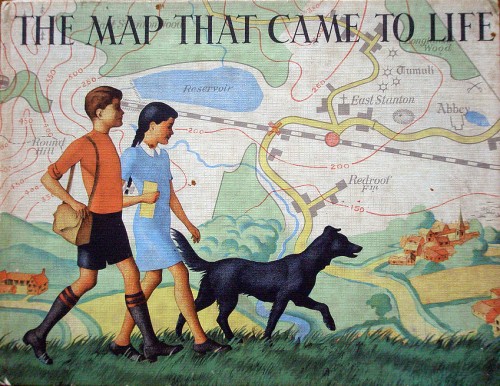
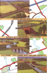
 A worthwhile post on English Buildings drew my attention to Ronald Lampitt's illustrations in The map that came to life, a children's book first published by OUP in 1948. Elsewhere there's also a complete set of spreads and a page about Lampitt's map of an ideal city.
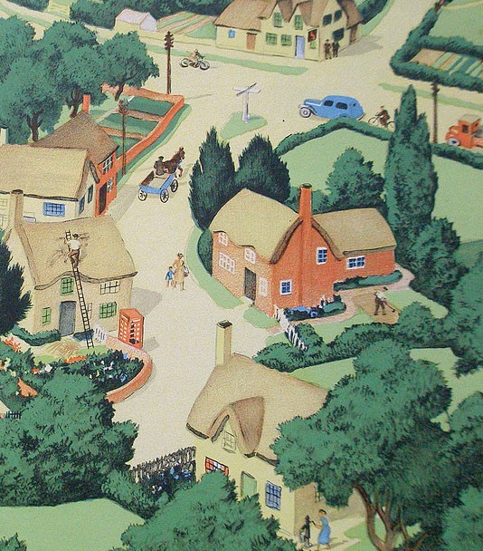
The beautifully illustrated cover is slightly reminiscent of Seurat's 'La Grande Jatte', without the pointillism. The book celebrates the fascination of maps as graphical language - ways of representing in two dimensions the richness of the real world. Lampitt paints the archetypal romantic (and very idealised) English village, set in a perfect landscape:
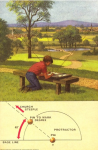
"These two children set off on a walk across unfamiliar country with only their map for guidance. They talk to strangers – who give them fascinating nuggets of local information rather than luring them into dark corners. Their dog spends most of its time off its lead, rivers and lakes hold no terrors for them, and, of course, this being 1948, they are not much troubled by traffic."
 Lampitt also worked for Ladybird, including the 1967 title Understanding maps, but information on him is scarce. Google Earth can't compete with Lampitt's golden vision of English Never-Never-Land.
 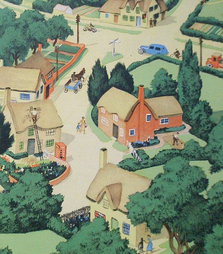 Secondhand copies appear rarely. A reprint is certainly overdue.