I got a £34 ticket in the front row of the upper balcony for £10, where empty seats there were more plentiful than in the packed arena above – where sat cost-conscious youth. So not a great commercial success. Does Mulhy pull off this attempt at using 'conventional' opera to bring social networking to the stage?
I certainly enjoyed the show, but with some major reservations. It had the clarity that so won over Edward Seckerson in his five star Independent review. Too trite to say this was because of it's lack of sophistication, but musically it lacked depth, dynamics and impact, save for the final, climactic ensemble scene. The orchestral music in particular is way down the list of what impressed. There's also naïvete about the libretto which was irritating. Did it have to be dumbed down for its conservative Metropolitan Opera commissioners? Some of the lines were either just daft or merely prosaic. A middle-aged DI who doesn't know what a server is? At least the chat speak made for some entertaining surtitles.
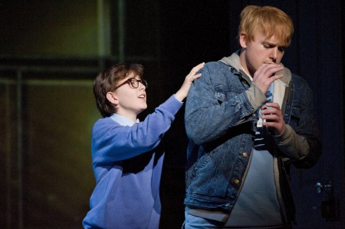
No wonder the music sounds a bit like washed out Britten: the wicked boy-loving gardener is a Peter (Grimes?) There's even gamelan. The vocal writing and performances especially are excellent, particularly Susan Bickley as the Detective, Nicky Spence as Brian and young Joseph Beesley as boy treble Jake. Visually it's impressive - all grey and monolithic, with huge whirling projections that map the net. The chorus gaze moodily into their eerily bright laptops and sing out in silhouette on the stairs of the two towers on which the internet chat that drives the story is projected.
Overall verdict: dramatically it's a compelling enough old style whodunnit with the bonus of sordid webchat fumblings (if you like that kind of thing) 'in the netherworld where there is nothing but cheerless cheer'. The singers are stunning, and the music has its moments, but too much of it lacks real impact. From the enthusiastic applause, 'Two Boys' was a hit with a mostly much younger, geekier crowd than is usual at ENO, if not with the group of twentieth century music enthusiasts that I spoke to in the interval. The internet brought them together, but Muhly's opera about its sinister side had failed to impress. Elsewhere the iPhones were glowing praise even before the conductor took his bow. Muhly can only get better, I hope.
Two differing reviews from blogs:
ENO plugs Seckerson's review