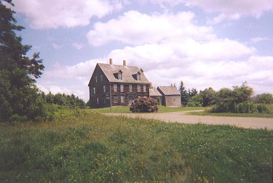
And like every other living thing we are putty in the hands of the changing seasons. Not an original thought, but one that struck me after bright sunshine followed several torpid weeks stuck indoors looking out at the freezing weather. A sunny morning and a brisk walk by the water and the sense of melatonin pumping from the pineal gland was almost palpable. Roll on the summer. I recalled seeing citizens of St Petersburg standing sunbathing by the water at the St Peter & Paul fortress, holding mirrors under their chins in order to soak up the maximum amount of sun.
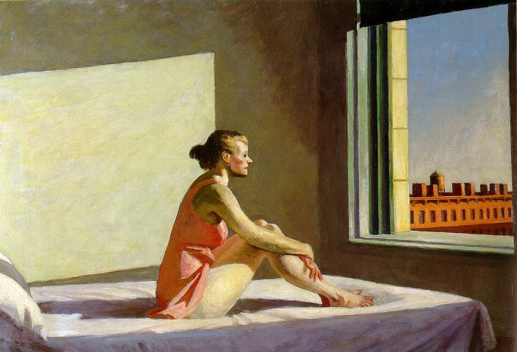
Also remembered was Hopper’s ‘Morning Sun’ (1952), seen last autumn at the Grand Palais in Paris. Light heals, or we hope it will. This blockbuster exhibition continues until 3 February. Work gathered from all over the globe and shows in a way that reproductions never can just what an innovator Hopper was – in choice of subject, use of light and handling of paint.
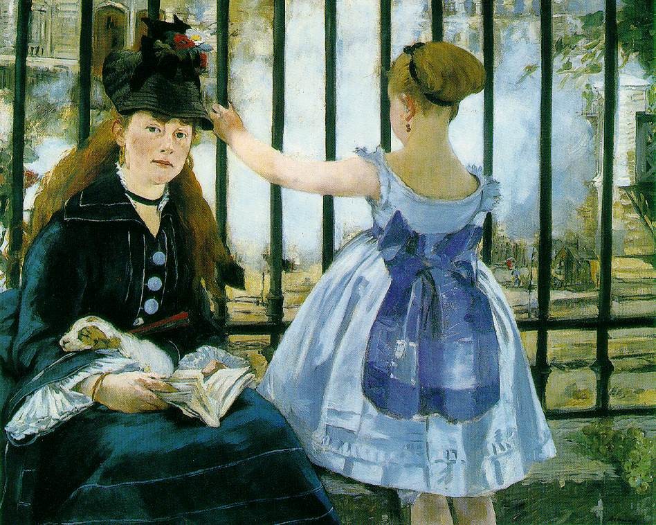
Another mega show, this time at the Royal Academy, promises to be just as impressive, and crowded too. Monet’s immaculately posed portraits of the well-to-do once seemed to lack the glamour and life of Renoir and Monet’s sun-washed exteriors. But as the critics are pointing out, what impresses is the painter’s original use of black and the deft way he can create the tiniest detail with a smudge of paint. These details will only be apparent by visiting the exhibition itself.