Ok

By continuing your visit to this site, you accept the use of cookies. These ensure the smooth running of our services. Learn more.

graphic design

  • Endangered species thriving in the crash

    5144_21102008.gifSpin-offs from the financial crisis proliferate. On Radio 4 Phill Jupitus' Strips provided the creators of the Telegraph's Alex cartoon with a platform. There were some interesting insights into the creative process and a side-swipe at the dearth of young people who can actually draw.

    Artist Charles Peattie and journalist Russell Taylor are both in their forties. They met at a party in 1986. Charles had a commission for a strip for the financial pages of the London Daily News and the result was Alex.

    The strip is a wicked send-up of nasty City types with such a huge following it has now turned into a stage show, with a film promised. The strip's creators are such experienced collaborators they develop the cartoon by email. Scans of roughs are swapped and layers of stuck-on emendations are built up.

    Peattie and Taylor mockingly described themselves as the 'Ant & Dec' of the UK cartooning world, since they are often the youngest attendees at cartooning conferences.

    Now that graphic designers draw with mice, what's the future for brilliantly-crafted satirical cartoons like Alex? Not good according to Peattie and Taylor: 'people don't learn to draw so much... cartoons depend on a fairly academic way of drawing... more [cartoonists] have died in the last decade than have come up'.

  • Lampitt's living maps

    2863068137_055aef279a_b.jpgA worthwhile post on English Buildings drew my attention to Ronald Lampitt's illustrations in The map that came to life, a children's book first published by OUP in 1948. Elsewhere there's also a complete set of spreads and a page about Lampitt's map of an ideal city.

    The beautifully illustrated cover is slightly reminiscent of Seurat's 'La Grande Jatte', without the pointillism. The book celebrates the fascination of maps as graphical language - ways of representing in two dimensions the richness of the real world. Lampitt paints the archetypal romantic (and very idealised) English village, set in a perfect landscape:

    "These two children set off on a walk across unfamiliar country with only their map for guidance. They talk to strangers – who give them fascinating nuggets of local information rather than luring them into dark corners. Their dog spends most of its time off its lead, rivers and lakes hold no terrors for them, and, of course, this being 1948, they are not much troubled by traffic."

    Picture 2.pngPicture 1.pngLampitt also worked for Ladybird, including the 1967 title Understanding maps, but information on him is scarce. Google Earth can't compete with Lampitt's golden vision of English Never-Never-Land.  2863882570_5ffe9958f2_b.jpgSecondhand copies appear rarely. A reprint is certainly overdue.

  • Hogarthian virtues

    979b5c4c5482d2429fd703048b8fec92.jpg

    b9af700ef3f3a05f4c8cb0ded08f2e0e.jpg

    Hogarth would have been proud of these stills from a biting satire on China's political record. The People's Republic executes more of its citizens than any other nation, many for minor crimes such as tax evasion. A similar idea occurred to a French designer for a much slicker but less effective piece of photographically based work:

    The attractive official logo is the work of 70-year old Han Meilin, known as the 'Chinese Picasso' who was apparently paid less than 10p for his work. Even allowing for different standards of living this seems remarkably low. Meilin's design alludes to Chinese calligraphic seals and has a recognisably oriental feel to it. The design works well - and so much better than the much derided 'streetwise' (and according to some fellatio-themed) 2012 Olympics logo:
    9f372155874dca9b6a7de3679afff4eb.jpga4b6425530f943fe5af4b566879baf2c.jpg

  • Blankets and blazons

    3818aebed5854d256cd49bbbd707723e.jpg

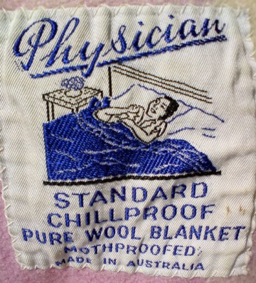
    Is it just me? I like old blanket labels. The design of some of these little scraps of silky cloth is fascinating. This 1950s blanket with its evocative label was brought by sea all the way from Australia over 40 years ago. Because she has a Physician chillproof blanket, the happy lady with the bedside flowers will soon be well again. With that sales pitch and with such a striking embroidered design, it's no wonder they sold.

    When they were younger my nieces were obsessed with the silky feeling of all kinds of labels. On blankets or teddy bears or sewn into clothing, stroking them was the perfect comforter. 'Continental quilts' (with all their associations of bright sunlit roms and Scandinavian health and efficiency) are all very well, but on a really chilly night you can't beat the comfort of a really good heavy woollen blanket.

    9590fc02ad8556e6a341df42bf8912ee.jpgccb665ad54d76723a095def83976fd08.jpg
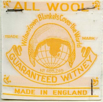
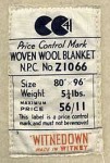
Here in Oxfordshire there was a long tradition of blanket making (they used 'tenter hooks' that are the origin of the familiar phrase). An excellent site, from which some of these images are taken, describes how until the last factory closed in 2002 the Witney blanket was a byword for quality. Made using local wool with a soft spun yarn that formed a fleecy pile, they were widely imitated until a trades descriptions case in 1907 put a stop to such 'passing off'.

    At its height, thousands of people were worked in the blanket making industry in Witney. The museum there holds a guardbook which contains over 150 blanket label designs used by just one manufacturer in the town.

    24ea33f2a3451b37b956e863d07c1b0d.jpg
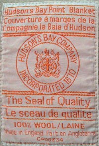
A special kind of Witney blanket was sold to the hugely powerful Hudson's Bay Company in Canada which traded them with native Americans for beaver furs. These point blankets are an early example of a graphical language being developed to symbolise a product standardisation system. The blankets were graded according to their size and warmth using a system of striped marks which showed up when the folded blankets were stacked together.

    There is a full description of the grading system on the Hudson's Bay Company website.

    In November 1779, M. Maugenest met with the Board at Hudson's Bay House in London to deliver his "Proposals of the Terms" under which he would enter into Hudson's Bay Company's service. He offered several suggestions for improving the growing inland trade from Fort Albany along the west coast of James Bay. The sale of "pointed" blankets was one of his suggestions. By December 1779, the sample blankets had been received by the Committee and an order was issued for 500 pairs of "pointed" blankets; 100 pairs of each, in 1, 1.5, 2, 2.5 and 3 point sizes. Although blankets had been a staple of the fur trade to the natives and Hudson's Bay Company men prior to 1780, it was not until the first shipment to Fort Albany in the spring of that year that they were shipped to the posts on a regular basis.

    By 1860 full standardization of both sizes and colours had been established.
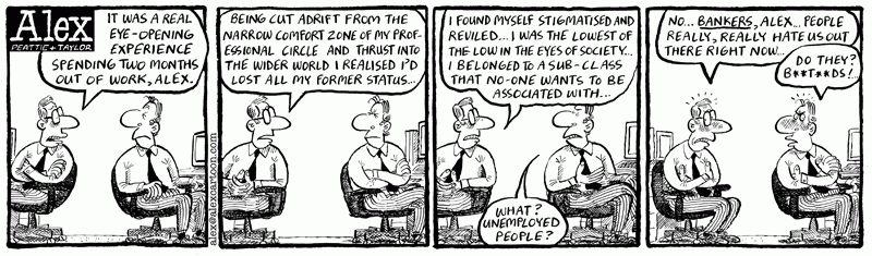
  • Waftaroms, indotherms and the graphic language of cartooning

    5e1862021bcdc98a8d317ca95ab3fd5c.png

    Don't know a grawlix from a plewd or an agitron from an indotherm? Finding words for the marks made by cartoonists is a funny business. A jokey article about the marks cartoonists make for things like movement, emotion and radiation is now the stuff of earnest research into the visual language of cartoons.

    It seems to have started with American cartoonist Mort Walker who wrote a satirical article in 1964 called "Let's Get Down to Grawlixes," for the National Cartoonists Society. In 1980 he expanded it to a book The lexicon of comicana. In Mort Walker's Private Scrapbook he writes:

    'I spoofed the tricks cartoonists used, like dust clouds when characters are running or lightbulbs over their heads when they get an idea... I spent many hours at the museum recording their "language". I created pseudoscientific names for each cartoon cliché, like the sweat marks cartoon characters radiate. I called them "plewds" after the God of rain "Joe Pluvius".'

    The spoof didn't quite work (even though the words he invented are very funny), because people really wanted words for the marks cartoonists make. So here is a run-down, from Wikipedia:

    • Plewds Flying sweat droplets that appear around a character's head when working hard or stressed.
    • Briffits Clouds of dust that hang in the spot where a swiftly departing character or object was previously standing.
    • Squeans Little starbursts or circles that signify intoxication, dizziness, or sickness.
    • Emanata Lines drawn around the head to indicate shock or surprise.
    • Grawlixes Typographical symbols standing for profanities, which appear in dialogue balloons in the place of actual dialogue.
    • Indotherm Wavy, rising lines used to represent steam or heat on hot objects -- however, the same shape found over a hot apple pie or something else strong smelling is a wafteron.
    • Agitrons Wiggly lines around an object that is shaking
    • Blurgits, swalloops Curved lines preceding or trailing after a character's moving limbs
    • Hites Horizontal straight lines trailing after something moving with great speed, or indicating reflectivity (puddle, glass, mirror). Likewise, up-hites would be lines above an object falling.
    • Lucaflect A shiny spot on a surface of something
    • Dites Diagonal, straight lines drawn across something flat, clear, and reflective, such as windows and mirrors.
    • Solrads Radiating lines drawn from something luminous like a lightbulb or the sun.
    • Vites Vertical straight lines indicating reflectivity (compare dites, hites)

    1db771f1c85e82a60fbd55ef5e240b79.jpgIt's funny in a Sellars & Yeatman kind of way (something else that deserves to be better known). Dash Shaw responded to the comic challenge with a great cartoon strip using the symbols and The Balloonist drew a booklet for cartoonists using some new symbols. Needless to say, the academically minded take it all very seriously. Neil Cohn just about gets the point. But only just:

    'He also attaches a myriad of useless names to them, to the extant that you feel that his whole point for jargon is to be facetious (which it may well have been).'

    dae386528cc4e0ed3e7dde35b217ae74.jpgSee also an explanation of Kirby Dots (developed by Jack Kirby to show an energy explosion) and a site devoted to cataloguing onomatopoeia like 'kaboom' (apparently first used in The incredible hulk, vol 1, no. 229, 1978).