Ok

By continuing your visit to this site, you accept the use of cookies. These ensure the smooth running of our services. Learn more.

Art & design - Page 2

  • Lampitt's living maps

    2863068137_055aef279a_b.jpgA worthwhile post on English Buildings drew my attention to Ronald Lampitt's illustrations in The map that came to life, a children's book first published by OUP in 1948. Elsewhere there's also a complete set of spreads and a page about Lampitt's map of an ideal city.

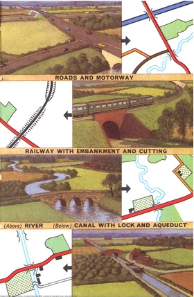
    The beautifully illustrated cover is slightly reminiscent of Seurat's 'La Grande Jatte', without the pointillism. The book celebrates the fascination of maps as graphical language - ways of representing in two dimensions the richness of the real world. Lampitt paints the archetypal romantic (and very idealised) English village, set in a perfect landscape:

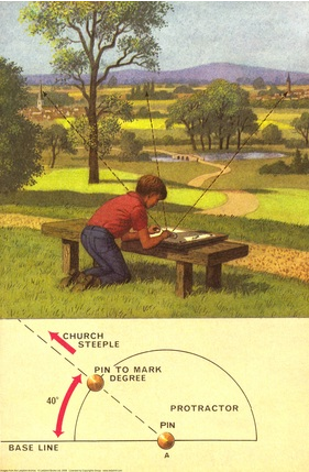
    "These two children set off on a walk across unfamiliar country with only their map for guidance. They talk to strangers – who give them fascinating nuggets of local information rather than luring them into dark corners. Their dog spends most of its time off its lead, rivers and lakes hold no terrors for them, and, of course, this being 1948, they are not much troubled by traffic."

    Picture 2.pngPicture 1.pngLampitt also worked for Ladybird, including the 1967 title Understanding maps, but information on him is scarce. Google Earth can't compete with Lampitt's golden vision of English Never-Never-Land.  2863882570_5ffe9958f2_b.jpg
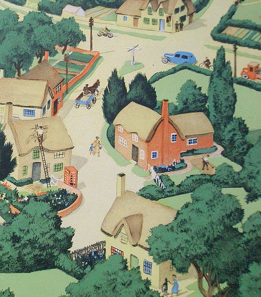
Secondhand copies appear rarely. A reprint is certainly overdue.

  • Hogarthian virtues

    979b5c4c5482d2429fd703048b8fec92.jpg

    b9af700ef3f3a05f4c8cb0ded08f2e0e.jpg

    Hogarth would have been proud of these stills from a biting satire on China's political record. The People's Republic executes more of its citizens than any other nation, many for minor crimes such as tax evasion. A similar idea occurred to a French designer for a much slicker but less effective piece of photographically based work:

    The attractive official logo is the work of 70-year old Han Meilin, known as the 'Chinese Picasso' who was apparently paid less than 10p for his work. Even allowing for different standards of living this seems remarkably low. Meilin's design alludes to Chinese calligraphic seals and has a recognisably oriental feel to it. The design works well - and so much better than the much derided 'streetwise' (and according to some fellatio-themed) 2012 Olympics logo:
    9f372155874dca9b6a7de3679afff4eb.jpga4b6425530f943fe5af4b566879baf2c.jpg

  • Getting a little list

    d4f273bb1b821c0d3bdc7d57c9961ba0.jpg

    I do like lists. For the prevaricator, the making of them is a satisfying way of delaying the work itself. For the anorak (and we all secretly have an anorak within, don't we?) lists are all about neatness and order and collecting. Like butterflies pinned down under glass, lists fix the worryingly mutable world.

    The UNESCO list of world heritage sites satisfies several of these instincts. Is the list complete? What are the selection criteria? Which have I been to? Where to next? In England, Bath; Blenheim; Stonehenge; Westminster; Durham and Canterbury all make their expected appearances. But not Oxford or the landscape gardens at Stowe or Lincoln or Wells Cathedrals or Windsor Castle? And what about the Lake District?

    The most recent UK addition is the newly cleaned-up satanic mills of Cornwall and West Devon. Other 'post-industrial' tourist sites are Saltaire (worth a visit but is it a world heritage site to match the tower of London?) and Derwent Valley Mills where Richard Arwright worked and there are '680,000 bobbins on display'. That is a lot of bobbins. And should I mention Liverpool?

    9a7b2a84074e40a21430547bcbe0892f.jpgf8a24eb5733869eb952b7fd32064d77c.jpgIn Sweden there are several longwave masts just waiting to be admired. And Bauhaus architecture in Tel Aviv, too. It's evident that some countries are better than others at agenda pushing.

    Reasons for smugness, and for poetry: Bruges, the Plantin-Moretus, Split, Dubrovnik, Trogir, Chartres, Mont St Michel, Amiens, Versailles, Pont du Gard, [the whole of?] Bordeaux, Paris, Cologne, the Vatican, Prague, Budapest, Vienna, Florence, Pompeii, San Gimignano, Vicenza, Sienna, the Amalfi, Naples, Verona, Tivoli, St Petersburg, Alhambra, Guadi, Ibiza, Drottningholm, Göreme, Istanbul, Troy, Pamukkale [no Ephesus?], And the Stautue of Liberty and the The Red Fort, Fatephur Sikri and the Taj Mahal. And some others I missed.

    a1bb787fa08278bdd165436331359e3c.jpgBut I was reassured to find plenty more for my own heritage site 'to do' list. Khajuraho, Aachen, the Acropolis, Mount Athos, Ravenna, Rietveld Schröder House, Butrint in Albania (been wondering about it for ages), Sintra, Valetta. Mérida, Salamanca, Route of Santiago de Compostela and a reassuring heap of places in former Soviet Republics including Riga, Český Krumlov and Tallin. And with less footprint, Hadrian's Wall and the Giant's Causeway.

    That's enough lists.

  • Blankets and blazons

    3818aebed5854d256cd49bbbd707723e.jpg

    Is it just me? I like old blanket labels. The design of some of these little scraps of silky cloth is fascinating. This 1950s blanket with its evocative label was brought by sea all the way from Australia over 40 years ago. Because she has a Physician chillproof blanket, the happy lady with the bedside flowers will soon be well again. With that sales pitch and with such a striking embroidered design, it's no wonder they sold.

    When they were younger my nieces were obsessed with the silky feeling of all kinds of labels. On blankets or teddy bears or sewn into clothing, stroking them was the perfect comforter. 'Continental quilts' (with all their associations of bright sunlit roms and Scandinavian health and efficiency) are all very well, but on a really chilly night you can't beat the comfort of a really good heavy woollen blanket.

    9590fc02ad8556e6a341df42bf8912ee.jpgccb665ad54d76723a095def83976fd08.jpgHere in Oxfordshire there was a long tradition of blanket making (they used 'tenter hooks' that are the origin of the familiar phrase). An excellent site, from which some of these images are taken, describes how until the last factory closed in 2002 the Witney blanket was a byword for quality. Made using local wool with a soft spun yarn that formed a fleecy pile, they were widely imitated until a trades descriptions case in 1907 put a stop to such 'passing off'.

    At its height, thousands of people were worked in the blanket making industry in Witney. The museum there holds a guardbook which contains over 150 blanket label designs used by just one manufacturer in the town.

    24ea33f2a3451b37b956e863d07c1b0d.jpg
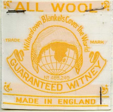
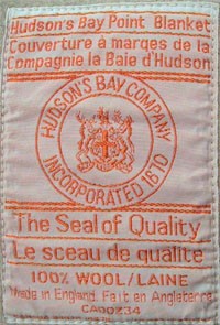
A special kind of Witney blanket was sold to the hugely powerful Hudson's Bay Company in Canada which traded them with native Americans for beaver furs. These point blankets are an early example of a graphical language being developed to symbolise a product standardisation system. The blankets were graded according to their size and warmth using a system of striped marks which showed up when the folded blankets were stacked together.

    There is a full description of the grading system on the Hudson's Bay Company website.

    In November 1779, M. Maugenest met with the Board at Hudson's Bay House in London to deliver his "Proposals of the Terms" under which he would enter into Hudson's Bay Company's service. He offered several suggestions for improving the growing inland trade from Fort Albany along the west coast of James Bay. The sale of "pointed" blankets was one of his suggestions. By December 1779, the sample blankets had been received by the Committee and an order was issued for 500 pairs of "pointed" blankets; 100 pairs of each, in 1, 1.5, 2, 2.5 and 3 point sizes. Although blankets had been a staple of the fur trade to the natives and Hudson's Bay Company men prior to 1780, it was not until the first shipment to Fort Albany in the spring of that year that they were shipped to the posts on a regular basis.

    By 1860 full standardization of both sizes and colours had been established.
  • Wren seen from a ziggurat

    9c82cbfaa4523657f400e727e31850f5.jpg

    A quick trip to London's Number 1 Poultry today. If you can get to the impressive roof garden there are stunning views that more than make up for the irksomely courageous whimsy of the controversial architecture.

    Peter Palumbo spent decades acquiring the site site piecemeal from 1958. His scheme to demolish the listed Mappin & Webb building and replace it with what Prince Charles called a 'giant glass stump' - a monumentally impressive bronze coloured steel and glass tower by Mies van der Rohe - was decisively thrown out in 1984.

    53a21ae7dd5163411210d9205b6b460e.jpg

    Palumbo's answer to his critics was to appoint RIBA medal-winner James Stirling to design a vigorously jokey post-modernist block.

    Stirling thought he had only a 50-50 chance of success. "I do regard this site as being very special, at this spider's web intersection surrounded by all those heroes like Lutyens and Hawksmoor and Dance. It's the quintessence of London."

    c747668cb81239ed04cbca0c94ca4cc0.jpg3631e743e2c45d3131851ceb816ea55f.jpgLike a stranded submarine decked out in pink stripes, the triangular building seems desperately to be sailing its giant conning tower up the slope towards the Mansion House. The stepped frontage ripples with fiddly bits. Triangles are punched out of the facade and theatrical games are played with circles and squares. The building has a bunker-like rear that currently accommodates a Wetherspoons.

    But it uses Portland stone and granite, and it contains echoes of the old buildings on site (if anyone remembers them) so it could hardly upset the purists, could it? Could it ever. Prince Charles demonstrated his familiarity with the latest technology when he said it looked like a 'broken 1930s wireless set'.

    Delayed by recession, the design was posthumously completed after Stirling died at the hands of an incompetent anaesthetist. Since then it has regularly won polls for both the best and worst building in London.

    ee3f9d233d68fdcdff2dd306f836a279.jpgWalk into the open rotunda at the centre of the development (with its irritating Dayglo coloured window casements) and take the lift to the Conran-run 'Coq d'Argent' roof garden restaurant and a whole new impression forms.
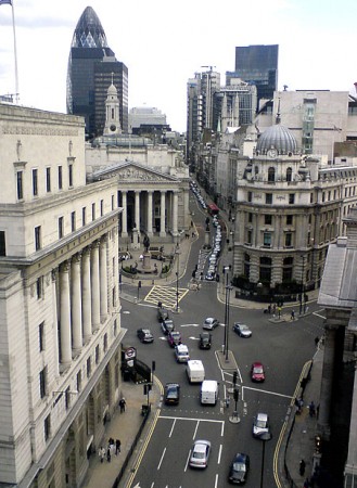
    Wisteria and hawthorn flourish. Fragrant box hedging leads to stunning views of the gherkin and Wren City churches from the glass ship's bridge, either side of the conning tower. Well worth a visit, especially on a Sunday when the people paid to keep rubber-neckers away from the rooftop are less likely to be on duty.


    fc617c9b14fd8ab17b2e5ddf36faaa27.jpg


  • Waftaroms, indotherms and the graphic language of cartooning

    5e1862021bcdc98a8d317ca95ab3fd5c.png

    Don't know a grawlix from a plewd or an agitron from an indotherm? Finding words for the marks made by cartoonists is a funny business. A jokey article about the marks cartoonists make for things like movement, emotion and radiation is now the stuff of earnest research into the visual language of cartoons.

    It seems to have started with American cartoonist Mort Walker who wrote a satirical article in 1964 called "Let's Get Down to Grawlixes," for the National Cartoonists Society. In 1980 he expanded it to a book The lexicon of comicana. In Mort Walker's Private Scrapbook he writes:

    'I spoofed the tricks cartoonists used, like dust clouds when characters are running or lightbulbs over their heads when they get an idea... I spent many hours at the museum recording their "language". I created pseudoscientific names for each cartoon cliché, like the sweat marks cartoon characters radiate. I called them "plewds" after the God of rain "Joe Pluvius".'

    The spoof didn't quite work (even though the words he invented are very funny), because people really wanted words for the marks cartoonists make. So here is a run-down, from Wikipedia:

    • Plewds Flying sweat droplets that appear around a character's head when working hard or stressed.
    • Briffits Clouds of dust that hang in the spot where a swiftly departing character or object was previously standing.
    • Squeans Little starbursts or circles that signify intoxication, dizziness, or sickness.
    • Emanata Lines drawn around the head to indicate shock or surprise.
    • Grawlixes Typographical symbols standing for profanities, which appear in dialogue balloons in the place of actual dialogue.
    • Indotherm Wavy, rising lines used to represent steam or heat on hot objects -- however, the same shape found over a hot apple pie or something else strong smelling is a wafteron.
    • Agitrons Wiggly lines around an object that is shaking
    • Blurgits, swalloops Curved lines preceding or trailing after a character's moving limbs
    • Hites Horizontal straight lines trailing after something moving with great speed, or indicating reflectivity (puddle, glass, mirror). Likewise, up-hites would be lines above an object falling.
    • Lucaflect A shiny spot on a surface of something
    • Dites Diagonal, straight lines drawn across something flat, clear, and reflective, such as windows and mirrors.
    • Solrads Radiating lines drawn from something luminous like a lightbulb or the sun.
    • Vites Vertical straight lines indicating reflectivity (compare dites, hites)

    1db771f1c85e82a60fbd55ef5e240b79.jpgIt's funny in a Sellars & Yeatman kind of way (something else that deserves to be better known). Dash Shaw responded to the comic challenge with a great cartoon strip using the symbols and The Balloonist drew a booklet for cartoonists using some new symbols. Needless to say, the academically minded take it all very seriously. Neil Cohn just about gets the point. But only just:

    'He also attaches a myriad of useless names to them, to the extant that you feel that his whole point for jargon is to be facetious (which it may well have been).'

    dae386528cc4e0ed3e7dde35b217ae74.jpgSee also an explanation of Kirby Dots (developed by Jack Kirby to show an energy explosion) and a site devoted to cataloguing onomatopoeia like 'kaboom' (apparently first used in The incredible hulk, vol 1, no. 229, 1978).


  • Ancient symbolism at the CND

    edece95e9c83a98361040c3a81be77f9.png

    2d16343a854e57bc3e52a2b8ef12dddd.gifThe CND is 50, and the organisation is commemorating its anniversary by encircling AWE at Aldermaston on Easter Monday, just as they did 50 years ago. A new book commemorates a half century of the campaign's enduring symbol, which according to its pacifist designer Gerald Holtom was based on the semaphore signals for N (nuclear) and D (disarmament).

    Creativity is a mysterious process, unamenable to logical analysis. Much that appears to be original turns out to be an imaginative fusion of things half-remembered. So it may well have been with the peace symbol, which takes the form of a circle around an inverted version of a Norse symbol - yggdrasil, the 'world tree', or great ash at the centre of the universe.

    An Ottawa Citizen review describes how Gerald Holtom asked a shop assistant what she thought of the symbol which was carried by the marchers on what he called 'lollipops'. She liked it, but wondered whether its drooping arms weren't "a bit depressing. Shouldn't peace be something to celebrate?" "He sort of altered his view in that moment," his nephew recalls. "He said, 'Yes, it should be a figure with the hands upwards outstretched'". From then on Holtom always drew the symbol upright.

    fef1de8e77ecd81bc887e2878527a9bc.pngIn his hugely influential 'Book of signs' (first published in German in 1923 as 'Das zeichenbuch' and available on Google Books) Rudolf Koch uses the symbol to stand for a man who undergoes the 'vicissitudes of life'. On his death, the symbol is inverted (and known as the 'todesrune'). With this meaning the symbol was officially specified for the gravestones of SS officers. Gerald Holtom asked to have the symbol - in its upright form - on his gravestone in Kent. That wish was ignored by the letter-cutter.

    In the runic alphabet a similar symbol to the yggdrasil is called algiz, (the elk) and is known as the rune of protection.

    Opponents of CND referred to the logo as 'the chicken's foot' and Hopi Indians use a similar design, based on the footprint of a crane, as a symbol of tribal unification. It can also be thought of as an inverted or broken cross, like that used to crucify St Peter.

    But the roots of the sign may well lie deep within all of us. As a Jungian archetype, it can be read as female genitalia. A sign for the ancient mother goddess, whose message of peace men so often ignore.

    First they came for the Jews
    and I did not speak out
    because I was not a Jew.
    Then they came for the Communists
    and I did not speak out
    because I was not a Communist.
    Then they came for the trade unionists
    and I did not speak out
    because I was not a trade unionist.
    Then they came for me
    and there was no one left
    to speak out for me.

    Pastor Martin Niemöller

    Rudolf Koch's symbols are available as a set of fonts issued by P22.

  • Apple's suspiciously tempting ways

    6255fca2bfe27bc2355fb5a27b1b8f19.jpg

    An article in Business Week attempts to get at the secret of Apple's design success. They say it boils down to developing ten genuinely different prototypes to a highly finished level, then letting two separate weekly meetings work away at them. One is briefed to only think 'blue sky', the other must address the practicalities. Ten ideas are then refined to three and finally to one.

    I've been using a Toshiba laptop instead of my usual Apple one. It's like comparing a Lada with a Porsche. The Toshiba is all tacky, plastic ugliness compared to the Mac's seductive, clean lines, where everything is understated, integrated and in just the right place.

    The Apple design process certainly works: Apple's laptop market share is up by 38% on last year, placing them 9th amongst the competition. The iPhone's iconic status as the must-have accessory for elite geeks so worries Google that they've launched a broadside against it. They claim their open source 'Android' programming environment will achieve more sales because it will be on many different manufacturers' phones.

    OK, Apple's design process is thorough, and mildly innovative, but that's not it. They succeed because they have an uncompromising design-led vision - and they stick with it because they know the quality of their design has become an overriding factor in their customers' buying decisions.

    Windows enthusiasts love to mock Apple and their lead designer Englishman Jonathan Ive CBE, whose early career famously included designing sanitaryware in London. Even in this apparently metrosexual age, there's bizarrely still something suspect about owning a computer that not only looks good but actually works as well. It seems real men not only don't eat quiche, they also don't do foofy computers that might (whisper it) call into question their owners' masculinity.

  • Truth in art at Christ Church

    4432c473930c15aadc655db53e3c3ca9.pngWhat is the 'real meaning' of art and what value should be placed on what is 'authentic' over the work of copyists?

    At Christ Church Picture Gallery, Oxford, Curator Jacqueline Thalmann provided a fascinating introduction to the collection which is housed in a striking subterranean gallery from 1968 by Powell and Moya.

    eaef4e2f6e96716514e857a644e4ac8c.jpgAlthough best-known for its collection of old master prints and drawings, over 200 paintings were bequeathed in 1765 by alumnus General John Guise, whose somewhat robust taste includes a Martrydom of St Lawrence by Tintoretto and a large and gruesome 'Butcher's shop' by Annibale Carracci (1560-1609) which since it was judged unsuitable for the contemplation of women hung in the College's kitchens for some 200 years.

    Before the Renaissance, the best religious icons were those that faithfully copied from precedent. The essence of the divine could only be transmitted by the careful replication of visual convention. Any notion of artistic originality was irrelevant.

    89e70d654d47ef6a23fb07dd2eeabd31.gif
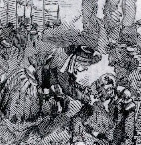
By Dürer's time the artist, not the subject, was the focus. His work – including a prominent monogram – was faithfully copied by a highly talented printmaker called Marcantonio Raimondi. In 1511 Dürer issued a devastating warning to anyone tempted to infringe what he was effectively asserting as his copyright: "Hold! You crafty ones, strangers to work, and pilferers of other men’s brains. Think not rashly to lay your thievish hands upon my works. Beware! Know you not that I have a grant from the most glorious Emperor Maximillian, that not one throughout the imperial dominion shall be allowed to print or sell fictitious imitations of these engravings? Listen! And bear in mind that if you do so, through spite or through covetousness, not only will your goods be confiscated, but your bodies also placed in mortal danger."

    In what must be one of the first cases of its kind, Dürer succeeded in getting an injunction against Raimondi banning him from ever again misusing Dürer's trademark.

    a44e4a72c9c45a7b97e9d12d62567a98.jpgIn common with the Carracci 'Butcher's shop', Anthony Van Dyck's 'Continence of Scipio' was revealed to be rich in multiple meanings. Van Dyck gave the famous Africa-conquering general filmstar looks, painting him into an epic scene reminiscent of Cecil B De Mille. Scipio's bright red cape billows as he nobly rejects the woman offered him in tribute. Her face is downcast and classically impassive whilst her betrothed, hand on heart, gazes beseechingly deep into the General's eyes.

    The work was commissioned from the young Van Dyck by his court champion the Duke of Buckingham, whose stone capital, carved with two male faces, frames the scene. But the connections with Buckingham run deeper – Scipio can be read as James I, and the beseeching figure as Buckingham himself – James' 'favourite' and lover.

    0c25bf764eaa3a13ea8abad0ede0877f.pngAccording to some 'queer historians' at least, gayness is also to be discovered in Dürer's life and work, not least in the woodcut 'Men's Bath' which features a prominent monogram (and a rather suggestive tap). Dürer's lifelong friend was a bisexual humanist called Willibald Pirckheimer. The humanist sent the artist drawings of the two of them in flagrante together. Consumed with jealousy, Mrs Dürer accused her husband of having a sexual relationship with the anagrammatic Pirckheimer.

  • The power of ornament

    04126ff5297075aeb5de340b582bc02e.jpgWeb find of the month is a site devoted to complete reproductions of illuminated books. It includes Owen Jones' astonishing Grammar of Ornament (1856), a tour de force of nineteenth century letterpress and chromolithographic printing which has had an incalculable influence on artists and designers from the Art Nouveau to Gaudi in Barcelona.

    Owen Jones' most influential book contains his own re-drawing on 'scientific' principles of over 2,000 decorative designs. The scope is vast: from designs created by 'savage tribes' to ornament from the ancient world, Arabia, China, India and Europe. The motifs presented range from intricate and highly elaborate high Renaissance manuscript illumination to apparently simple geometric tile designs from Moorish Spain and Persia.

    3ec4da26d09c197e2237f28ca316e248.jpg


    A passion for the orient

    Jones (1809-74) was an architect who became passionate about the superiority of non-European ornament after touring Turkey, Egypt, Sicily and Spain in 1831. Henry Cole, who founded the Victoria & Albert Museum, was one of his many collaborators.

    Jones' passion for the near east found expression in his most significant work as an architect on the interior of Christ Church, Streatham. He was criticised for his  'excessive use' of Islamic motifs there.

    Acclaimed for his decorations for the Great Exhibition in 1851, Jones worked for nine years on the publication of a lavish folio work, which exploited the capabilities of the relatively new and demanding process of chromolithography. He sold property to finance its publication, setting up his own press and training his own staff to produce it. He did not live to see it succeed commercially, and many copies were remaindered.

    Besides including a historical survey and commentary on the many gorgeous full page colour illustrations, Jones developed a series of 37 'design propositions' which attempted to codify the construction of well-made ornament. For Jones: 'All ornament should be based on geometrical construction' And 'true beauty results from that repose which the mind feels when the eye, the intellect, and the affections, are satisfied from the absence of any want'. In his final chapter he advocated a new kind of architecture based on natural forms.

    0d3645ad78fa779f296b451d62f68411.jpg
    The rhythm of life

    There is an enduring appeal in many of these stunning illustrations. They combine a remarkable and carefully constructed rhythmic intensity with a highly developed colour palette. Since the Modern Movement, architects and designers have associated ornament with the literally superficial, seeing it as a layer of irrelevant decoration that obscures the underlying nature of whatever it is applied to.

    For me and I suspect for Jones, the desire to decorate is an integral part of human experience. His use of geometric reconstruction seems to link to metaphysical ideas of the golden section or 'divine proportion' which were taken up by Modern Movement architects such as Le Corbusier.

    Good ornament is intrinsic to the very essence of things.

    The Grammar of Ornament on CD-ROM for designers.

  • Reni's St Sebastians at Dulwich

    5668a38b4891e71cabdcd55c0cb9c5a8.jpg
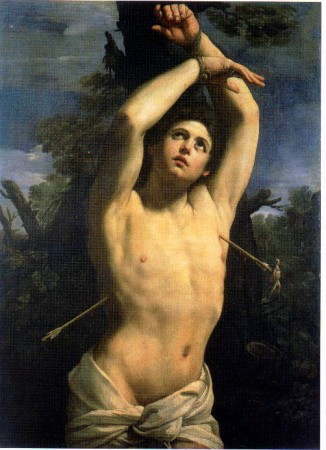
Seven paintings, all of the same subject: a beautiful, almost naked youth, tied to a tree, in the throes of martyrdom. Five are almost identical versions of the same composition, from galleries as far away as Puerto Rico and New Zealand. All are uncompromising in their directness. The painting from Genoa inspired Wilde, Mishima and Pierre & Gilles. Stendahl claimed they so distracted the faithful that they had to be removed from churches.

    The St Sebastians of the 'divine Guido' Reni (1575-1642) feature in an exhibition at the Dulwich Picture Gallery until May 11. It offers the public the chance to play an intriguing game of art historical 'spot the difference'. Which are 'real', which are copies? How much is the work of the master, and how much of his studio? Why are they such gay icons?

    0bdf791c743620928b081fe2b01b0fb6.jpgThe Rome painting lacks the impact of its Genoese neighbour. The paintwork is softer, the face and body less defined. A third arrow has pierced the martyr's side and the feathers of another don't now clash with the Roman soldier in the background.

    Standing in front of Reni's version from Genoa it is easy to see why it had such impact on Wilde: an athlete of classical build is indifferent to his wounds. Sacred: his boyish, asexual face, framed by his pinioned arms, gazes heavenward. Profane: his loincloth slips provocatively, emphasised by a partly turned hip.

    7cd7ffb875854fbdebbf336d03113218.jpgPierre & Gilles and Jarman also responded to this sultry mix of agony and ecstasy. Yukio Mishima had himself photographed as St Sebastian and in Confessions of a Mask the narrator discovers his sexuality because of a print of the painting.

    Of the six versions of the (earlier?) composition, that from New Zealand is the most obviously different. The brushwork is far looser, there is less light - yet in spite of these differences, the current view is that it is by Reni himself. Comparing the others on view, they all seem as one.

    e3ddbbe2034eca85ebdc03310a1b7080.jpg 711ae672ff87b3d9396011671f379c49.jpgThe Dulwich's own St Sebastian was long thought to be a copy of the painting in the Prado, Madrid. Now restoration has revealed signs of pentimenti (second thoughts) that have enabled its attribution as Reni's own work.

    For one critic Reni was self-consciously re-working notions of light, texture and atmosphere, the repeated composition a means to an end. Perhaps the explanation for so many versions is more prosaic: Reni wanted cash and welcomed requests for repeat business. He certainly went on to make other paintings of this middle-aged Roman soldier, the parton saint of sufferers of the plague, who met his final end only after his wounded body was dragged out of the cloaca maxima. Either way this Dulwich exhibition (which deserved much greater space) is fascinating.

    The exhibition is complemented by a catalogue which contains more art historical analysis than is usual. Also on show was 'The age of enlightenment: Beardsley, Dulac and their Contemporaries 1890-1930' - Beardsley's perfumed and obsessional exoticism providing another take on image making.

    Comprehensive Survey of images of St Sebastian

    Review in the Independent

  • From style moderne to Modernism: the rise and fall of the remarkable process of M. Jean Berté

    312ada268d85371db3aaddf9a4d49bad.jpg

    Nan Ridehalgh's talk to the Imprint Society of Reading about her original research into the Jean Berté watercolour printing process prompted this.

    42bed0513ead397ae1581ae41d331de1.jpg

    Before photographs could be reproduced in print, there were the Dalziel Brothers. So when the Illustrated London News wanted to put images of the Crimean War before its readers in 1855, it sent five artists to the battlefields to draw what they saw.

    The Dalziel Brothers were then instructed to cut their versions of the drawings out of hard boxwood. These hand-engraved blocks were printed by letterpress, transmitting the drawn images of war to a mass readership. But by around 1906, when the last member of the Dalziel dynasty died, commercial wood engraving had virtually disappeared, replaced by 'photomechanical engraving' which made it possible to acid etch a photograph on to a copper printing block.

    But hand-cut image making for the masses was not dead yet. There was still the remarkable reprographic process developed by Jean Berté. He used hand-cut rubber-faced letterpress printing blocks printed using his own luminous water-based inks.

    Berté seems to have begun work in his native France before the end of the nineteenth century. Overprinting six or more of the purest, most translucent colours, he was able to mass produce images of such freshness and startling impact that they looked hand painted. Perhaps the resemblance was intended, since Berté seems to have been forced to leave France for the US, accused of 'passing off' his work as the real thing.

    98f82adc4de9ead4bc38ce244483b026.jpg6189c71d9c969238425593e4dbba32b9.jpg He introduced his process to American printers in 1927. After obtaining  patents he licensed it to more than a hundred firms across the nation. Stunning images featuring large areas of flat, bright colour often bounded by a conventionally printed black keyline were eagerly taken up the glamorous new 'advertising men', busy riding the wave of the pre-depression boom. Berté's copywriting had impact, too. He promised to make the 'velvet softness of a sun-kissed cheek' 'live again'.

    Printing trade journals featured gorgeous images of tropical seas and exotic birds in vivid reds, oranges and yellows (reminiscent of Clarice Cliff's pottery), promoting the glorious impact of Berté's colours. The style was frequently Art Deco (or style moderne), since that look favoured large areas of flat, bold colour and complemented Berté's inventive new printing process. Soon a few of Berté's images even began to appear in Britain.

    But with a few notable exceptions, British printers were largely unmoved by the brilliance of M. Jean Berté's wonderful new images. These bright colours were all very well for the Americans, but perhaps they didn't fit with the printed aesthetic of the day, driven as it was by Stanley Morison's revivals of historic printing types for the Monotype Corporation.

    540f5042426f6db97d4102020d0c5a8b.png3a8ddd6891cd5503b0650e77b99c906e.pngOne exception was the printing house of Herbert Reiach on the south bank in London. The company produced a range of book jackets for Batsford designer Brian Cook using the Berté process. With their bold designs and bright (even garish) colours the titles fairly leapt from the shelves. Given the modernity of their jackets, it seems odd that the subject of many of the Batsford books was nostalgic. In wartime, Batsford's 'Face of Britain', 'English Life' and 'British Heritage' series comfortingly described the landscape, traditional pubs and old villages.

    In his 90th year, Arthur Spence, a former Berté craftsman, described to Nan Ridehalgh how he had worked at Lund Humphries with a sharp scalpel, cutting images from pieces of vulcanised rubber, locked into an adjustable turntable which was mounted on a sloped drawing board. At first the process was 'pretty crude' but then became more refined.

    bda6d2bca33506f9685f8a082758499f.jpg72d03c55c31972073779593c588772a6.jpgIn London after the war, much that had not already been destroyed by bombs was swept away. New cityscapes of concrete and glass rose in the square mile and on the south bank a new people's playground was going up for the 1951 Festival of Britain. Moderne gave way to Modernism - the aesthetic of Abram Games' logo for the Festival was machine-made, the colours cool blues, red and black. To my eyes at least, the Festival Hall seems grey and not at all celebratory.

    Jean Berté's bright American colours, printed from hand-cut blocks, must have seemed at odds with the spirit of the time. At Batsford in the early fifties, Brian Cook designed his last few jackets, applying the process to a more muted palette. But time was up for the hand-cut Berté blocks and for the riverside premises of Herbert Reiach. They were bulldozed to make way for the new south bank. The company relocated to Faringdon Street but soon after all traces of it are lost.