Ok

By continuing your visit to this site, you accept the use of cookies. These ensure the smooth running of our services. Learn more.

Art & design

  • We are nature too

    2013-01-26 12.50.16.jpg

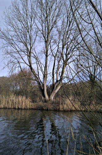
    And like every other living thing we are putty in the hands of the changing seasons. Not an original thought, but one that struck me after bright sunshine followed several torpid weeks stuck indoors looking out at the freezing weather. A sunny morning and a brisk walk by the water and the sense of melatonin pumping from the pineal gland was almost palpable. Roll on the summer. I recalled seeing citizens of St Petersburg standing sunbathing by the water at the St Peter & Paul fortress, holding mirrors under their chins in order to soak up the maximum amount of sun.

    morn_sun.jpg

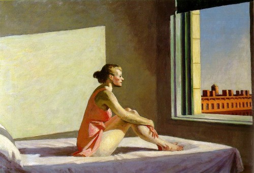
    Also remembered was Hopper’s ‘Morning Sun’ (1952), seen last autumn at the Grand Palais in Paris. Light heals, or we hope it will. This blockbuster exhibition continues until 3 February. Work gathered from all over the globe and shows in a way that reproductions never can just what an innovator Hopper was – in choice of subject, use of light and handling of paint.

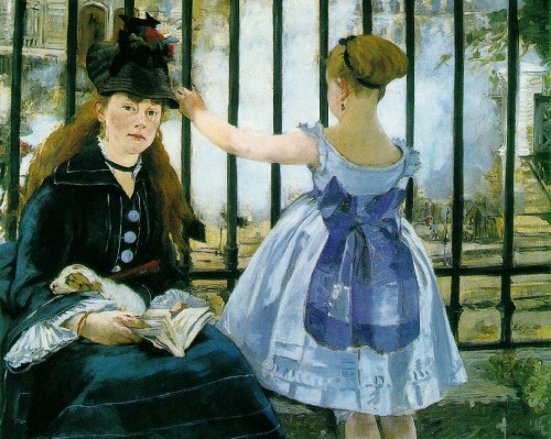
    Another mega show, this time at the Royal Academy, promises to be just as impressive, and crowded too. Monet’s immaculately posed portraits of the well-to-do once seemed to lack the glamour and life of Renoir and Monet’s sun-washed exteriors. But as the critics are pointing out, what impresses is the painter’s original use of black and the deft way he can create the tiniest detail with a smudge of paint. These details will only be apparent by visiting the exhibition itself.
    manet.railroad.jpg

  • Curiouser and curiouser at Waddesdon

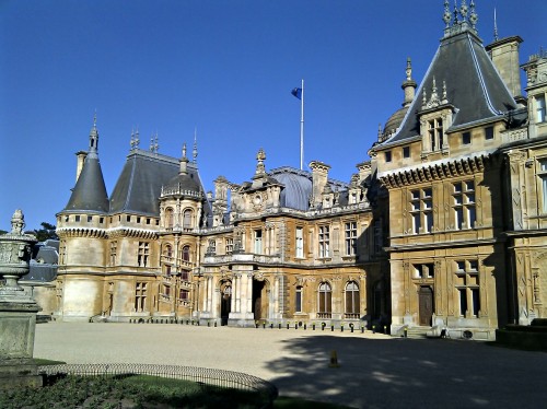
    Waddesdon Manor

    Devoted art lover or not? You might want to consider a trip to Waddesdon Manor in Buckinghamshire where the latest experiment in juxtaposing ancient (or rather neo-renaissance) and modern is on show. I was able to make a trip there yesterday afternoon.


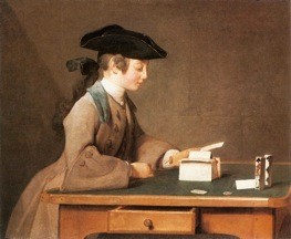
    Exhibited in the gardens are 33 'responses' to Chardin's painting 'House of Cards' which is to be found within the Manor. They have been made by as broad a cross-section contemporary artistic luminaries as you are likely to find in any public gallery. Names like Gormley, Koons, Kapoor and inevitably Hirst (whose works here are available to buy if you happen to have several million handy), plus slightly less well-known names: Serra, Judd, Tony Smith and even a Rothschild.

    Without knowing the context, as the explanatory leaflet had yet to be provided, we were unimpressed by Serra's huge cube of balanced corten steel plates. 'House of cards' is at the centre of the show and seeks to establish its theme, which is that nothing is at it seems. Its uniform, rusty massiveness failed to delight us, unlike several of the other pieces we saw.

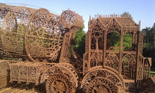
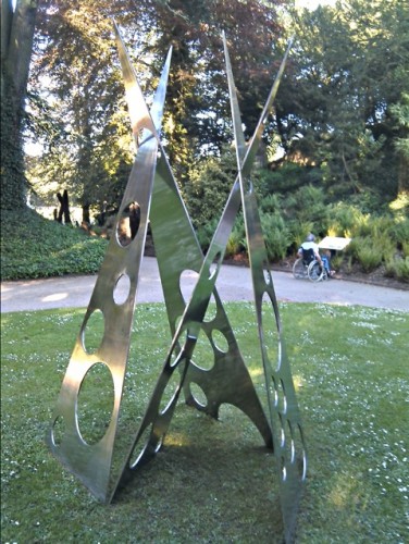
    Some impressed partly by their sheer technical sophistication. Steel can now be laser cut with microscopic precision into the most delicate of filigree patterns.


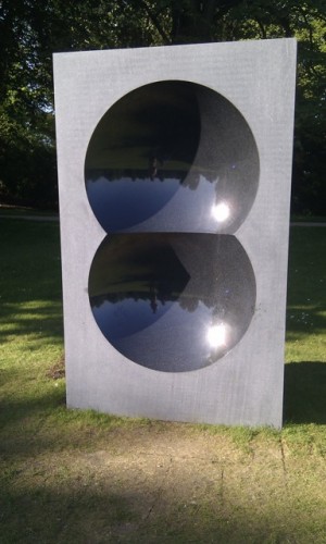
    Granite can be transformed into paradoxical mirrors. A monolith weighing 6.7t has been polished by Kapoor into intersecting hemispheres that reflect an upside down world.


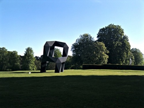
    Smith's 'Moondog' is named after a New York poet and musician and a Joan Miró painting. It weighs almost two tonnes, and had to be installed on grass that could not be disturbed to more than six and a half inches. Like a house of cards, it balances precipitously, its massive forms making an engaging counterpoint to the rococo ornament all around it.

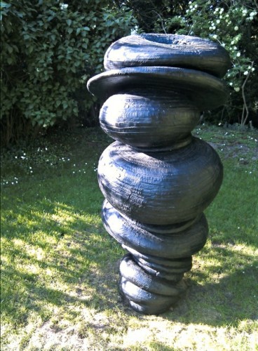
    Turner prize winner Tony Cragg defies gravity but does not delight the eye with his pile of tyreish turds, 'Wirbelsäule' (spine):


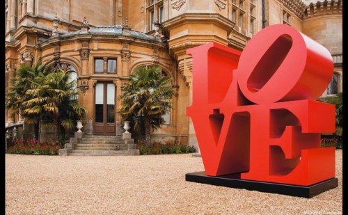
    Robert Indiana's steel 'Love' is close to classical statues of Venus and Cupid.


    Eva Rotschild's 'Meta' evidently works with the house of cards theme. The result is a pleasing interplay of sharpness and curves.


    There's a lot more we didn't have time to see or photograph, including an inevitably bifurcated pig and a spotted mini (Hirst) and a huge steel teapot that perfectly matches the 'Alice in Wonderland' theme that Christie's have adopted in their video which publicises the show. The exhibition benefits from being set amid the natural forms of the formal gardens at Waddesdon, which as we left, seemed themselves to take on sculptural qualities.

    You have until 28 October to catch the exhibition, which officially closes at 5pm (although we wandered round in tranquillity until almost 6.30)

    See also an excellent FT article with an interview with Jacob Rothschild.

  • Early influences on Crouwel, and his legacy

    media_httpwwwnotcotco_eBCzD.jpg.scaled500.jpg

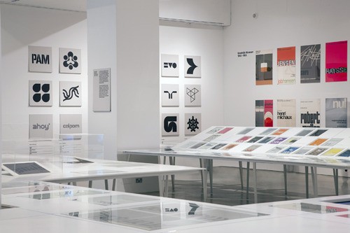
    I very much enjoyed a visit to the Wim Crouwel exhibition on its closing day at the Design Museum. Looking at the show's design, which is very much in the spirit of his work, I was struck by a line in a video interview shown there. He attributes much of his success to an early collaboration with Chinese architect Kho Liang Ie, saying (if I paraphrase correctly) that he very much responded to the Eastern sensibilty in Kho Liang Ie's work, with its emphasis on atmosphere and simplicity.

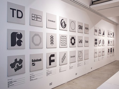
    Crouwel's huge influence and the freshness – even today – of his designs prove his success. Work by Peter Saville, Banks & Miles and 8vo were among many very evidently inspired by Crouwel. They also featured at the Design Museum. The exhibition asserts that Crouwel single-handedly defined the graphic look of Holland – from his work in the sixties on Schiphol to enumerable logos for companies like Fasson, Fodor, Makro, Rabobank and Randstad. The radical simplicity of these logo designs is very recognisably Crouwel, but how much has he caught the 'atmosphere' of the organisations?

    tumblr_lmder6AtK51qzqavpo1_500.jpg

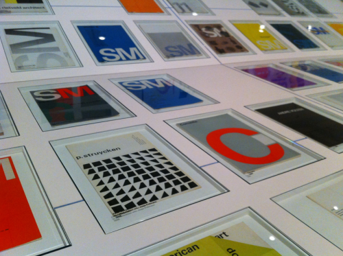
    Grids and fonts like Univers (and not necessarily Helvetica) continue to be key in his work. Some strikingly creative calendars were among my personal favourites. Crouwel is by no means averse to serifs, and attributes much of his early success to a fantastic relationship with an ideal client who only criticised his work after it had been published. If only they were all like that. In another memorable quote he describes a book 'as a three dimensional grid'. At almost 83, Crouwel is still productively and creatively working.

    Picture 5.png

    It's a pity that the slim and small format catalogue was so expensive at £17 and that it resorts to tricksy photography to show a great man's work.

    These are useful links:


    Picture 6.png

  • Moving pictures

    Not particularly new, but this short sequence by Prof Hans Rosling (on the Gapminder site that has influenced Bill Gates' charitable giving) tells a powerful story.


  • Hair affairs

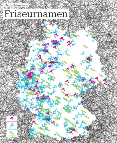
    deutschlandkarte-popup-600.jpg

    From the site Strange Maps comes this record from Die Zeit of the popularity of awful puns in the names of German hairdressing salons. The most popular is 'Haarmonie'. The others uphold that unfortunate line about the missing Germanic funny bone: Haareszeiten puns on Jahreszeiten - which means seasons - and Haargenau just means 'exactly' in the sense of 'to a hair'.
    Enertaining whimsy, including the menacing hairy outer darkness surrounding Germany, but not very effective map-making. I wanted the map to be dynamic, revealing photos of shop signs, much like the ones featured in the Hairdressers With Funny Names Pool on Flickr.

    Picture 2.png
    sanseriffe2.jpg
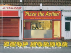
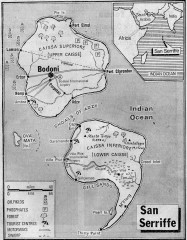
    The predeliction of English salons for this kind of linguistic tomfoolery is so great that they made up a good part of a Guy Swillingham's Shop horror: the best of the worst in British shop names. If you can excuse a comment about one map which is made up of 'mere typography' Strange Maps has many other gems, including a description of  the Guardian's April 1977 feature on San Seriffe
  • Mind the breaks

    3139413582_ae26fa38b9_b.jpg
    2860159067_971cfd6cf3_b.jpgSign spotted by James Wallis in King's College Hospital, and posted to Flickr.

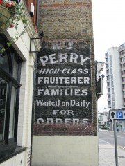
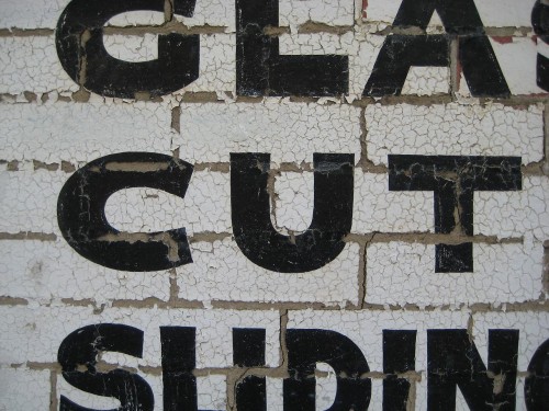
    Some of the best sign-related groups on that site are collections of fading wall advertising, like these two examples. Besides the visual appeal, the lettering is social history. Our local corn merchants is now a Chinese restaurant. There'll be no more bicycle deliveries for the fruiter's boy. Fruit and veg is so much better travelled these days and we are all the richer for year-round strawberries, aren't we?3113254940_5366ecb9dd_o.jpg

  • Entire of itself

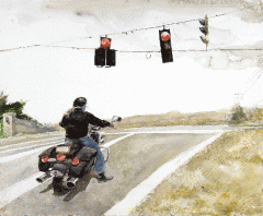
    Wyeth Christinas World detail 2 1000.jpg

    No man is an island, entire of itself; every man is a piece of the continent, a part of the main. If a clod be washed away by the sea, Europe is the less, as well as if a promontory were, as well as if a manor of thy friend's or of thine own were. Any man's death diminishes me, because I am involved in mankind; and therefore never send to know for whom the bell tolls; it tolls for thee.

    John Donne, Meditation XVII, 1624

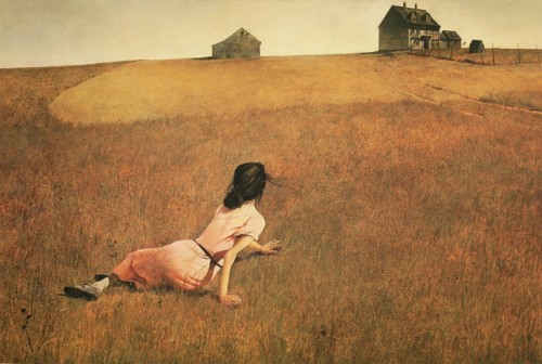
    The painter Andrew Wyeth died yesterday, reminding me of the first time I saw 'Christina's World'. I was about 8 and there was a tiny reproduction of the painting in my father's Reader's Digest art book. I felt for the girl so far from her scary looking home. What was her expression? Was she worried or was she happy?  In fact Wyeth's subject (if not his model) was a young woman called Christina Olson (1893-1968) who may have had polio. The Olsons were friends of Wyeth's wife, and for 30 years he had a studio in their house in Cushing, Maine.

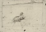
    2255486049_4bc27927bf_o.jpgChristina lived there all her life, shunning medical intervention, and refusing the description of 'crippled' which people tried to apply to her. Wyeth painted her with what may now seem like mawkish poignancy, crawling back from a visit to the family cemetery where she herself is now buried. Wyeth's wish for pathetic effect shows in his sketch for the painting.

    Wyeth Christinas World detail 1 1000.jpgAndrew Wyeth was part of a dynasty of artists: he was taught by his father and his son is a successful artist. The Reader's Digest text describes Wyeth as 'financially the most successful painter working in America now'. A review in Time describes 'Wyeth's problematic legacy'. Like the Scottish painter Jack Vettriano Wyeth is a little too popular and certainly much too meticulously figurative to meet with mainstream critical approval.

    stop.gifWhat strikes me now about 'Christina's World' is Wyeth's ability to evoke a sense of place. But it's a place that is edgy, disturbing, unreal, unattainable. The same emptiness and isolation is in his later work, but without the hard-edged light and luridness of Edward Hopper's art with which Wyeth's paintings have so often been compared.

  • A psychotronic new year

    vlcsnap-13214.png

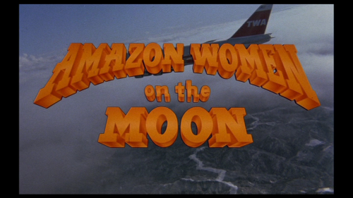
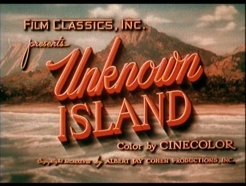
    If it's low budget, scary or a bit brutal then it's psychotronic. The term was dreamt up by Michael Weldon after he reviewed hundreds of quirky and obscure films including the 1980 Chicago cult sci-fi title The Pscychotronic Man. The sometimes brilliantly expressive hand-rendered titles are probaby the highlights. They run from 'The Adventures of Buckaroo Banzai' to 'Zontar: the Thing from Venus' and include spaghetti westerns, horror and exploitation films, made for a quick profit with little thought for merit.

    These images are from a collection made by Mr. Bali Hai. Lettering has never been scarier. See also the title sequence for Le Souffleur at The Art of the Title: one of the few recent examples on this site where the lettering is more important than the underlying images.

    vlcsnap-64750.jpg

    vlcsnap-112553.jpgvlcsnap-505672.jpg

    vlcsnap-579523.jpg

  • Following the diagram in Lisbon

    Picture 4.png
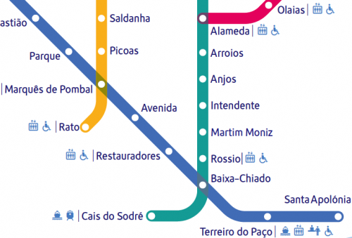
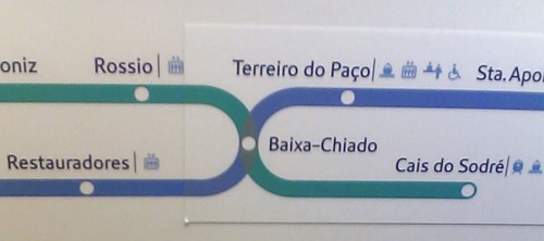
    In Lisbon I much enjoyed the metro system, which is full of art and something of which the city is clearly proud. Its diagram uses Metrolis, a custom font from The Foundry. The lines are called seagull, sunflower, caravelle and orient: they have over-fussy graphics that don't quite fit the clean diagram. On the trains themselves the maps can get interesting too. I'm not colour blind but couldn't quite work out why the linear maps seem to turn in on themselves so much. Metrobits.org has a page which lists the fonts used in some 17 metro systems and (if you're listening Santa) I now have to add Metro Maps of the World (new edition, Mark Ovenden) to my Christmas list.
    Picture 1.pngmetro inside.jpg

  • On the up: a vertical pier for Brighton

    127_2770.jpg211008-i360.gif
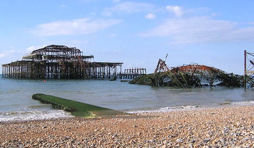
    The designers of the London Eye, architects Marks & Barfield, are confident that their upwardly mobile replacement for the wrecked West Pier will be open by 2011. Work has already begun on the i360 project which has already been dubbed an 'iSore' by its critics. It will consist of a 100-person fibreglass pod which will gently rise up a 144 yard tall steel cylinder, giving unmatched views of the city, sea and downs.

    Marks & Barfield place their design in the tradition of other south coast examples of pioneering architecture (presumably such as the modernist De La Warr Pavilion). The seaside attraction will be topped by wind turbines which will provide some of the power needed to operate it. The West Pier Trust still hopes it will eventually rebuild the elegant pier which was the star of Ken Russell's 'Oh what a lovely war!' as well as featuring in several of the 'Carry On' films.


  • Letters from Bethlehem

    DSC01020.jpg

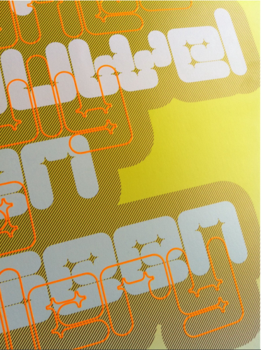
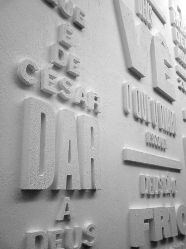
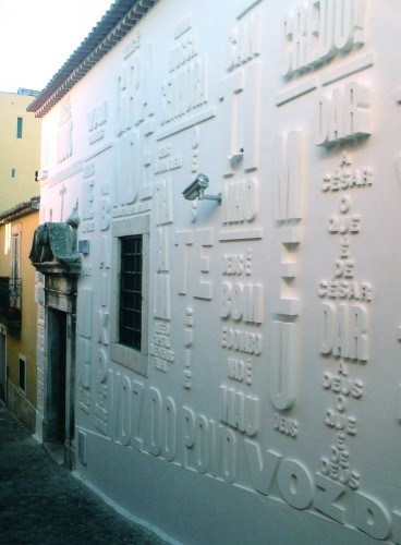
    Up a narrow street in Belem, Lisbon, and just yards away from the hungry tourists queuing for their Pasteis de Nata (the custard tarts which are a Lisbon speciality)  there is a chapel which re-opened as a gallery in September this year. Its outer wall has been transfomed by an art installation inspired by wood type. Chunky sans serif lettering of differing heights and depths has been applied to the wall and then given a coating of bright white render. The bold capitals are stacked into arrangements vaguely reminiscent of Henrik Werkmann.

    The Chapel of the Immaculate Conception was dedicated in 1707. Unlike much of central Lisbon, it survived the catastrophic earthquake of 1755. The messages which now cover much of the outer wall are mostly religious, and more rigidly arranged than Werkmann's anarchic experiments. The piece is called 'Vai com Deus' (Go with God) and is the work of Oporto studio R2 Design.

    It must have been a nightmare to specify and install. The letters have been individually pinned to the wall and are not always spaced or aligned with the kind of perfection we are used to. Perhaps this is why it has yet to feature on the web site of the award winning designers.

    DSC01022.jpg


  • Endangered species thriving in the crash

    5144_21102008.gifSpin-offs from the financial crisis proliferate. On Radio 4 Phill Jupitus' Strips provided the creators of the Telegraph's Alex cartoon with a platform. There were some interesting insights into the creative process and a side-swipe at the dearth of young people who can actually draw.

    Artist Charles Peattie and journalist Russell Taylor are both in their forties. They met at a party in 1986. Charles had a commission for a strip for the financial pages of the London Daily News and the result was Alex.

    The strip is a wicked send-up of nasty City types with such a huge following it has now turned into a stage show, with a film promised. The strip's creators are such experienced collaborators they develop the cartoon by email. Scans of roughs are swapped and layers of stuck-on emendations are built up.

    Peattie and Taylor mockingly described themselves as the 'Ant & Dec' of the UK cartooning world, since they are often the youngest attendees at cartooning conferences.

    Now that graphic designers draw with mice, what's the future for brilliantly-crafted satirical cartoons like Alex? Not good according to Peattie and Taylor: 'people don't learn to draw so much... cartoons depend on a fairly academic way of drawing... more [cartoonists] have died in the last decade than have come up'.