
Nan Ridehalgh's talk to the Imprint Society of Reading about her original research into the Jean Berté watercolour printing process prompted this.
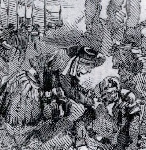
Before photographs could be reproduced in print, there were the Dalziel Brothers. So when the Illustrated London News wanted to put images of the Crimean War before its readers in 1855, it sent five artists to the battlefields to draw what they saw.
The Dalziel Brothers were then instructed to cut their versions of the drawings out of hard boxwood. These hand-engraved blocks were printed by letterpress, transmitting the drawn images of war to a mass readership. But by around 1906, when the last member of the Dalziel dynasty died, commercial wood engraving had virtually disappeared, replaced by 'photomechanical engraving' which made it possible to acid etch a photograph on to a copper printing block.
But hand-cut image making for the masses was not dead yet. There was still the remarkable reprographic process developed by Jean Berté. He used hand-cut rubber-faced letterpress printing blocks printed using his own luminous water-based inks.
Berté seems to have begun work in his native France before the end of the nineteenth century. Overprinting six or more of the purest, most translucent colours, he was able to mass produce images of such freshness and startling impact that they looked hand painted. Perhaps the resemblance was intended, since Berté seems to have been forced to leave France for the US, accused of 'passing off' his work as the real thing.

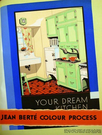 He introduced his process to American printers in 1927. After obtaining patents he licensed it to more than a hundred firms across the nation. Stunning images featuring large areas of flat, bright colour often bounded by a conventionally printed black keyline were eagerly taken up the glamorous new 'advertising men', busy riding the wave of the pre-depression boom. Berté's copywriting had impact, too. He promised to make the 'velvet softness of a sun-kissed cheek' 'live again'.
Printing trade journals featured gorgeous images of tropical seas and exotic birds in vivid reds, oranges and yellows (reminiscent of Clarice Cliff's pottery), promoting the glorious impact of Berté's colours. The style was frequently Art Deco (or style moderne), since that look favoured large areas of flat, bold colour and complemented Berté's inventive new printing process. Soon a few of Berté's images even began to appear in Britain.
But with a few notable exceptions, British printers were largely unmoved by the brilliance of M. Jean Berté's wonderful new images. These bright colours were all very well for the Americans, but perhaps they didn't fit with the printed aesthetic of the day, driven as it was by Stanley Morison's revivals of historic printing types for the Monotype Corporation.

 One exception was the printing house of Herbert Reiach on the south bank in London. The company produced a range of book jackets for Batsford designer Brian Cook using the Berté process. With their bold designs and bright (even garish) colours the titles fairly leapt from the shelves. Given the modernity of their jackets, it seems odd that the subject of many of the Batsford books was nostalgic. In wartime, Batsford's 'Face of Britain', 'English Life' and 'British Heritage' series comfortingly described the landscape, traditional pubs and old villages.
In his 90th year, Arthur Spence, a former Berté craftsman, described to Nan Ridehalgh how he had worked at Lund Humphries with a sharp scalpel, cutting images from pieces of vulcanised rubber, locked into an adjustable turntable which was mounted on a sloped drawing board. At first the process was 'pretty crude' but then became more refined.

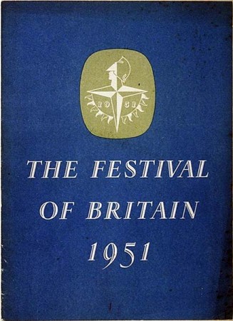 In London after the war, much that had not already been destroyed by bombs was swept away. New cityscapes of concrete and glass rose in the square mile and on the south bank a new people's playground was going up for the 1951 Festival of Britain. Moderne gave way to Modernism - the aesthetic of Abram Games' logo for the Festival was machine-made, the colours cool blues, red and black. To my eyes at least, the Festival Hall seems grey and not at all celebratory.
Jean Berté's bright American colours, printed from hand-cut blocks, must have seemed at odds with the spirit of the time. At Batsford in the early fifties, Brian Cook designed his last few jackets, applying the process to a more muted palette. But time was up for the hand-cut Berté blocks and for the riverside premises of Herbert Reiach. They were bulldozed to make way for the new south bank. The company relocated to Faringdon Street but soon after all traces of it are lost.