An article in Business Week attempts to get at the secret of Apple's design success. They say it boils down to developing ten genuinely different prototypes to a highly finished level, then letting two separate weekly meetings work away at them. One is briefed to only think 'blue sky', the other must address the practicalities. Ten ideas are then refined to three and finally to one.
I've been using a Toshiba laptop instead of my usual Apple one. It's like comparing a Lada with a Porsche. The Toshiba is all tacky, plastic ugliness compared to the Mac's seductive, clean lines, where everything is understated, integrated and in just the right place.
The Apple design process certainly works: Apple's laptop market share is up by 38% on last year, placing them 9th amongst the competition. The iPhone's iconic status as the must-have accessory for elite geeks so worries Google that they've launched a broadside against it. They claim their open source 'Android' programming environment will achieve more sales because it will be on many different manufacturers' phones.
OK, Apple's design process is thorough, and mildly innovative, but that's not it. They succeed because they have an uncompromising design-led vision - and they stick with it because they know the quality of their design has become an overriding factor in their customers' buying decisions.
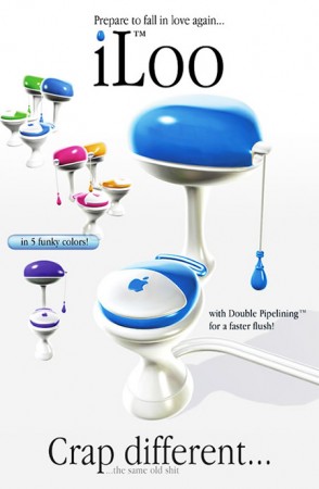
Windows enthusiasts love to mock Apple and their lead designer Englishman Jonathan Ive CBE, whose early career famously included designing sanitaryware in London. Even in this apparently metrosexual age, there's bizarrely still something suspect about owning a computer that not only looks good but actually works as well. It seems real men not only don't eat quiche, they also don't do foofy computers that might (whisper it) call into question their owners' masculinity.